Hi all! Yet another long gap between posts. I'm going to do my best to stay on schedule in the future.
Some updates in the life of Jiya. I just finished my second term of study in Computer Science and am having a blast. The last two weeks were more stressful than any since high school, but it was worth it. I pulled a nice fat 3.5 GPA this term, and I'm going for a 4.0 next term. Considering last term was 17 credits and this term will only be 14, I think it's definitely do-able!
Over the break I played a lot of Minecraft. I purchased the game in September and played a lot at that time, then took a long break from it. Now my wonderful house-mates are playing again on a server my roommate is running. It's wonderful because we've also got some of my friends from Seattle on the server now, which is a wonderful way to keep in touch. The world we're in has huge pillar-like mountains, which we have each claimed one of, and have an increasingly intricate network of bridges connecting them. It's wonderful!
Other games I've played over the break include Civ V, which I probably played for almost 24 hours straight after downloading it. Lots of fun, but I've already gotten a bit bored with it. I am on a big sandbox game kick, so I tried out both Wurm Online and Dwarf Fortress. Wurm's interface and graphics are so clunky I don't think I can keep with it, though the ideas and the sheer detail of the system are intriguing! Dwarf Fortress has a dauntingly steep learning curve, but my roommate is helping me learn the ropes. Lots of fun, but I'm such a stickler for polished graphics and UIs that I probably won't be able to handle it.
This sandbox game kick has got me thinking about making a sandbox game of my own, but I'm not sure if I'll follow through. I've jotted down all the ideas I've had so far, though - just in case!
I may or may not have downloaded the first season of the Pokemon TV show... Re-watching the cartoons of my youth is excellent fun!
I've also gotten to pursue my love of cooking over spring break. I've been able to cook a nice meal for myself and my house-mates almost every day this week, and it's been awesome. Spending more time with my house-mates makes me so incredibly grateful for the wonderful home we've been able to make together. When I came up with the idea for the Geek House, I never knew it would be such a success! For those who don't know, when I moved to a new city in September for school I used craigslist to find a group of nerdy people to live with. We managed to find a huge, wonderful, quirky 5 bedroom house 10 minutes from downtown in a lovely and very safe neighborhood, and crammed 8-9 people into it (one doesn't technically live here but is around probably about half the time). It's awesome always having people to play board/card/video games with.
Finally, I've been working on a D&D campaign for my house-mates all break, and we'll be starting it up this week. Should be all sorts of fun. It's great having so many creative outlets!
Well, that's an update on what I've been up to while I've NOT been blogging. Back to the normal schedule tomorrow!
NOTE: I'm changing my Thursday post to be a personal update post, rather than gaming news - it just felt like a chore to search for something to blog about there, and this isn't a news blog, so I feel the news post is unnecessary.

Tuesday, March 29, 2011
Tuesday, March 1, 2011
Photobooth Portrait Project
Remember last week when I said I'd been painting all weekend and promised a post about the results? Well, it's a week late but I finally have that post for you!
Since I haven't done one of these type of posts before, I'll explain my intention. I don't want to simply post a picture of my artwork and wait for replies of "ooh aahhh". Instead, I want to share what I did and what worked, and what didn't. Sort of a documentation of the process behind it.
The project was one assigned for my art class. The idea was to become familiar with paints and to experiment with different color palettes. I found this project especially interesting because the shading is reminiscent of sprite shading - you'll see what I mean in a minute.
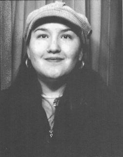
The first step of the project was to go to one of those old style black and white photo booths and get a photo taken. There's a website which lists all the photo booths in the area, photobooth.net. Unfortunately some of the booths listed on the site are either no longer at the location or are broken. Even calling ahead for each site, I had to visit three places before I found one that worked.
The photo booths have some sort of black magic ju ju inside them that makes you look WAY better than you normally do in photos. Something about the flash-bang lights that literally blind you (I came out of the booth in tears from the things flashing in my eyes), the washed-out old style printing, and the nature of black and white in general smears away your flaws and imperfections. It's somewhat of an archaic art to get your head actually centered correctly in the things, since all you have to work with is some vaguely reflective glass and a set of instructions that are confusing at best, downright incorrect at worst. Finally, after over an hour of driving around and 8 dollars fed into various (sometimes broken) machines, I returned triumphantly with the following:
 The next step in the process is to blow up the photo of your choice to 8.5 x 11, and to heighten the contrast. Since my scanner believes firmly that it should only work when it feels like it, I headed over to the local Fed Ex place to get the scanning and editing done. Initially the guy working there planned to charge me five dollars for the scan, edit, and print... but he relented after how easy it turned out to be and just charged me for the custom scan (1 dollar). Not too bad, and I made a friend for when I had to return later for another part of the project. So finally I had what I needed to get started:
 The next step in the project was to create stencils, since we would be painting the same thing four times and the idea was to have consistency. The method to create these stencils was to place tracing paper over the large high contrast print and trace out shapes of high, medium, or low value. We then taped the tracing paper to a manella folder and used an exacto knife to cut the shapes out. These stencils would be used strictly as guides, NOT as paint resists - you'll see what I mean in a moment.
 Once I had my stencils, it was time to test them. First I used the stencils to create a shape drawing - valueless interconnected shapes which make up the portrait, created by running a pencil along the inside edge of stencils. I don't have a version of that to show, unfortunately. As a test to make sure everything had come through in the stencils (it's easy to miss something since you are using multiple stencils), I shaded the values in with pencil. This would basically be what the final project would look like, but with pencil instead of paint:
 Since it looked correct, I could start painting. Again, I didn't use the stencils as paint resists, but just to draw the initial "sketch" on the paper with pencil. I then set aside the stencils and painted.
We were instructed to do four paintings, all using acrylic paint. I'll talk about mine in the order that I like them, from worst to best. The first one was a master palette - this means we looked around at master level paintings and chose one whose colors appealed to us, then chose three colors from that painting to use in our own. I've always been drawn to the 36 views of Mount Fuji (best known for the Great Wave off Kanagawa), and chose #8, Inumi Pass, Koshu as the painting I would choose a palette from. The 36 views of Mount Fuji are interesting because they are actually woodblock prints, a style of painting traditional to the Japanese in which the image is cut out of a piece of wood, then the wood is painted and the image is transferred to paper from the paint-laden wood block. The resulting images were extremely complex, but the method is actually analogous to stencil artwork.
 Of course, I wanted a physical copy of the painting to work with, so I set off to the Fed Ex again to get it printed. This time I had a whole slew of troubles - the image was a jpeg, and apparently their self-serve (read:cheap) printers only deal with pdfs. I asked the lady at the counter if she could just print it off for me. She opened it up right in front of me but said, no, she couldn't, I would have to pay for time at the computer to convert it to a pdf, then use the self-serve printer. Irked, I nevertheless headed over to the computers only to find a wide array of possible "plans" with different software available and no idea what I would need to select to convert the file. Luckily my printing-happy friend (who was Japanese and ended up striking up a whole conversation about Mount Fuji and wood block printing) from my last visit ended up rescuing me and printing the image off for a mere fifty cents. I guess being friendly to people does occasionally pay off!
Print in hand, I finally settled down to paint. The colors I chose were mostly in order to not duplicate any of my previous palettes. I actually painted this one last, and by then I was quite tired and in no mood to wait to get things exactly right. So the colors aren't exactly spot on (they are far too dark), and the mid tone's value is indistinguishable from the dark value. Regardless, here it is:
 My next painting's prompt was to choose two complementary colors - colors that are across from eachother on the color wheel. I chose blue and orange. For my third color, I chose a lighter orange. So my dark tone was dark blue, my midtone was normal orange, and my light tone was pale orange.
I was excited about this paintings because I'm very fond of bright, warm colors like orange, and because the blue I had was so pretty. Unfortunately, these two paints were TERRIBLE to work with. The gorgeous blue was extremely thin and transluscent, and even with four layers you can still see the page below (or the orange where I had to paint over it, since I'm worse than a five year old at coloring inside the lines). The orange, on the other hand, was chunky beyond bearing - the face looks like I was terribly burned or something, with a nasty pockmarked texture from me struggling with the detail work. I'm sure if I was more experienced in my paint handling, it wouldn't be so bad... but as it is, I feel pretty unhappy with it. Again, regardless, here it is:
 The third assignment was to do analogous colors, colors next to eachother on the color wheel. I chose green and yellow. This was the first painting I did, and if I'd had a bit more experience at the time I think it would be my favorite - but I had never painted with acrylic before (and had barely painted at all, with anything), so I was still learning the very basics about how to deal with the paint. So the face is a bit chunky and the borders where colors meet are messy.
Note: I totally didn't realize when I was doing this one that it's U of O colors. Bleh. Anyway, here it is:
 My favorite ended up being the monochrome painting, where we chose multiple shades of the same color. I chose brown, and the paint was a delight to work with - thin enough to use easily but not translucent like the blue. I definitely had the best technique for this painting. While the colors may not be as interesting, I feel like the values worked well. Here it is:
 Well, that's the project! Hope it was interesting to see the process behind it. I'll probably be covering a few more of my art class projects in the next few weeks.
Since I haven't done one of these type of posts before, I'll explain my intention. I don't want to simply post a picture of my artwork and wait for replies of "ooh aahhh". Instead, I want to share what I did and what worked, and what didn't. Sort of a documentation of the process behind it.
The project was one assigned for my art class. The idea was to become familiar with paints and to experiment with different color palettes. I found this project especially interesting because the shading is reminiscent of sprite shading - you'll see what I mean in a minute.
The first step of the project was to go to one of those old style black and white photo booths and get a photo taken. There's a website which lists all the photo booths in the area, photobooth.net. Unfortunately some of the booths listed on the site are either no longer at the location or are broken. Even calling ahead for each site, I had to visit three places before I found one that worked.
The photo booths have some sort of black magic ju ju inside them that makes you look WAY better than you normally do in photos. Something about the flash-bang lights that literally blind you (I came out of the booth in tears from the things flashing in my eyes), the washed-out old style printing, and the nature of black and white in general smears away your flaws and imperfections. It's somewhat of an archaic art to get your head actually centered correctly in the things, since all you have to work with is some vaguely reflective glass and a set of instructions that are confusing at best, downright incorrect at worst. Finally, after over an hour of driving around and 8 dollars fed into various (sometimes broken) machines, I returned triumphantly with the following:


We were instructed to do four paintings, all using acrylic paint. I'll talk about mine in the order that I like them, from worst to best. The first one was a master palette - this means we looked around at master level paintings and chose one whose colors appealed to us, then chose three colors from that painting to use in our own. I've always been drawn to the 36 views of Mount Fuji (best known for the Great Wave off Kanagawa), and chose #8, Inumi Pass, Koshu as the painting I would choose a palette from. The 36 views of Mount Fuji are interesting because they are actually woodblock prints, a style of painting traditional to the Japanese in which the image is cut out of a piece of wood, then the wood is painted and the image is transferred to paper from the paint-laden wood block. The resulting images were extremely complex, but the method is actually analogous to stencil artwork.

Print in hand, I finally settled down to paint. The colors I chose were mostly in order to not duplicate any of my previous palettes. I actually painted this one last, and by then I was quite tired and in no mood to wait to get things exactly right. So the colors aren't exactly spot on (they are far too dark), and the mid tone's value is indistinguishable from the dark value. Regardless, here it is:

I was excited about this paintings because I'm very fond of bright, warm colors like orange, and because the blue I had was so pretty. Unfortunately, these two paints were TERRIBLE to work with. The gorgeous blue was extremely thin and transluscent, and even with four layers you can still see the page below (or the orange where I had to paint over it, since I'm worse than a five year old at coloring inside the lines). The orange, on the other hand, was chunky beyond bearing - the face looks like I was terribly burned or something, with a nasty pockmarked texture from me struggling with the detail work. I'm sure if I was more experienced in my paint handling, it wouldn't be so bad... but as it is, I feel pretty unhappy with it. Again, regardless, here it is:

Note: I totally didn't realize when I was doing this one that it's U of O colors. Bleh. Anyway, here it is:


Subscribe to:
Posts (Atom)