Friday, September 1, 2017

Event: Devcom/RESPAWN and Gamescom


This time last week, Roy and I were getting onto a plane to head back from an amazing adventure in Germany. We were there for an entire week, for the combination of Devcom, RESPAWN, and Gamescom. At these conferences, we were not exhibiting, but instead were volunteers - and I can't recommend the experience enough!

Devcom


Devcom is a new conference, filling the void left by GDC Europe. This was its first year, and it hit its fair share of hiccups. It is geared for more traditional game developers, has loads of useful talks and networking, and was generally very useful. I'm really happy to see that it is already confirmed to run again next year, and I definitely recommend attending, especially if you volunteer! Volunteers get access to all the Devcom talks and attendee parties, so it's a great opportunity. This year we also got access to the vault, so we can watch any talks we missed while on shift.

RESPAWN


RESPAWN is a returning conference, but not one I had attended before. I loved it. More than Devcom, this was a conference geared towards me - the indie developer. The presentation was fun - apparently they do themes each year, this year it was a "fun faire" theme with stages named after Ferris Wheels, Cotten Candy, etc, and an actual fun fair area with silly fair games. The talks were small, fast paced, practical, and intended for an indie developer audience. There was also an indie developer showcase area. One thing that was very interesting and really cemented the feel of the conference was that all talks were held in one giant room - each "stage" was just a group of chairs around a large TV, and speakers used a mic linked to headsets worn by the attendees to get their talks heard above the noise of the hall. It was an interesting way to handle the space and really made the experience feel unique. Again, we were given access to the RESPAWN talks while not on shift, and I really enjoyed them.

Gamescom


Gamescom needs no introduction for most European gamers, but for my American readers, introduce I shall - it is the biggest gaming convention in the world and takes place each year in Cologne, Germany. We were volunteering for the Devcom area in one of the Gamescom trade halls, but while not on shift we were free to wander both the trade and general show floors. As it was the last year I came, it was a crowded, crazy, amazing experience. We got to explore the trade area, meet great folks there, and play loads of awesome games in the consumer area. We watched the Blizzard "reveal" in person (they weren't revealing much this year), played Monster Hunter World, and generally had a great time hunting swag and fun.


Volunteering
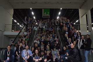

Volunteering made the entire experience far better than it would have been alone. When you join the volunteer program, you instantly get a large group of awesome people with whom to attend talks, parties, and explore the show floor. I ended up taking on some extra duties this year with the volunteers, and it made the experience even better. Last time I volunteered, I had a great time but I feel like not too many of the other volunteers remembered me afterwards. This year, because I was very visible and active in my role there, I expect many more of them will remember me (hopefully fondly!). Due to my volunteer position I also got to meet several important folks in the industry including the director of ID@Xbox and the manager for Warcraft's design department. It was pretty great!

I highly recommend attending these conferences if you are able to, especially as a volunteer, The tickets can be pretty expensive normally, but as a volunteer you get in for free - only lodging and transportation are needed! I do hope someday to exhibit at RESPAWN or Gamescom, but for now, volunteering is a great way to make contacts and friends!

NOTE: Pictures (aside from the stock gamescom one) by fellow volunteer Laurens Mathot.

Friday, June 23, 2017

Event: Norwich Games Fest

A few weeks ago, Bounder Games went on the road south for the Norwich Gaming Festival. This is a smaller industry event which has quite a variety of content, including indie games such as ours, talks, a VR showcase, a physical and vintage games tent, and even a laser tag course for the kiddos (both small and large). I was really impressed by all the different content at the show, from a consumer perspective. As a dev, I loved the laid back feel of the show and the opportunity to get to know other developers and try out some really interesting and innovative games. It was also great to get feedback on Armoured Engines both from the public and from other devs.


What We Showed


We brought a demo very similar to the one we showed at EGX Rezzed in April. On the surface, we'd made some tweaks to the tutorials based on the feedback we received. Underneath, it was a vastly changed game - I had revamped the entire data storage system and also implemented asset bundles, a huge undertaking that introduced loads of bugs. Thankfully we caught many (though not all!) of them before the show.


What We Learned


One of the main reasons for showing at Norwich was audience feedback. Unfortunately, we mainly learned that our tutorial pain points are still problems. People still have trouble dragging coal to our boxcar, they still have trouble noticing the button in the upper left even though it has a massive star under it, and there are a few other problems kicking around in the level. We have ideas to fix these issues - we'll have to see at the next conference if they pay off.


Who We Met


We also got to meet some amazing indie devs! I won't try to mention them all by name here, but we had an amazing weekend and had a blast talking shop with awesome people. This was my favorite part of the show - getting to play other indie games and chat with the devs. To our booth mates and everyone else we talked to - thanks for a wonderful experience!

Overall, this was an awesome experience and I really want to return next year. While the festival was free to show at, the travel costs were high to get all the way down to Norwich - however, I feel like the experience and contacts we made were totally worth it. Besides, we had a blast, so it was almost like a holiday. Til next year, Norwich!

Friday, February 24, 2017

Global Game Jam Postmortem - "Wavapillar"

Last month, Bounder Games created a game for the 2017 Global Game Jam. The theme was "waves", and what we finally decided on was a game about being a caterpillar, due to their "wave-like" motion. The game is called Wavapillar, and you can play it over at itchio: https://boundergames.itch.io/wavapillar

A Wavapillar match

Overall, the game was a big success - first of all, we finished something, which for me is a huge bonus. Secondly, it was well received by players, netting us quite a few votes at the play party for the jam, but not enough to win. However, there were a lot of places in development of the game where I personally felt I needed a lot of work, and where I learned a lot of lessons.

Brainstorming

The first issue we ran in to was very early, while brainstorming ideas. In the past, I have faced two problems in this area - one, that it took too long, and two, that it resulted in a game idea I was not excited about and which was therefore hard to motivate myself to work on.

In this jam, at first no one had any break out ideas. One designer was pushing us to make light wave physics puzzles, which would probably have been fun to design for but felt very boring to me looking at it from a player perspective. I just couldn't get excited about the idea, but couldn't think of anything better.

Then I came across the idea of a caterpillar's movement. From there, we started building on ideas for control schemes, the sources of fun, and game types. But the same designed just wasn't in to that idea, probably for the valid reason that he couldn't think of a fun way to design puzzles and environments for the idea. This caused us to butt heads a bit. I really struggled between trying to be firm about what I wanted and how I felt, but not being overbearing. In the end, the rest of the team seemed to like the caterpillar idea so that's where we went.

I really struggled in this jam to keep my comments constructive and to not take design decisions and criticisms personally. Part of that was my mental health condition at the time, but it's something I always have to work towards. I plan to look in to effective brainstorming techniques for future jams and concentrate on making sure we have a process for everyone to feel heard and to ensure the final idea is one everyone can run with.

Pixel Art

We decided to go with a pixel art style for Wavapillar, mostly because I wanted to - in my mind, I had this idea that it would match all the gorgeous pixel art games I see on my Twitter feed. However, I'd never really made a pixel art game before, myself working in vector art primarily. I underestimated all the bits and pieces of "getting it right" for pixel art: no scaling, since pixels wouldn't all be the same size; no rotation, since pixels shouldn't be rotated; etc. In the end we broke some of these rules, and should have just dispensed with them for the jam. It was an unnecessary source of stress that I should have let go of early on.

Programming Priorities

On to some things that went well. Despite my emotional and interpersonal issues, I think for once I did a good job with my programming prioritisation for this jam. I concentrated first on getting the caterpillar movement right, since that was the core of the game and the designers would need to test it out and tweak things. It was also the part of this idea's programming which I would be least familiar, since it was heavily physics based and I had not much used the physics system of the engine we were using (Unity). I had to try a few different types of joints to get the effect I wanted for the caterpillar's movement, but in the end I had something that worked pretty well.

Time Management

Our time management for Wavapillar was pretty good compared to my previous few jams. We actually got something finished and uploaded in time, for one thing, though it was a desperate scramble at the end mostly due to internet issues. I still think this is an area that I can improve in, but it's nice to see some progress being made.

Multiplayer

Making a local multiplayer game was amazingly fun. It was so wonderful to see groups of people jostling and shouting good naturedly at eachother. Wavapillar focuses on a deliberately awkward two player control scheme where two players share a controller and control one side of a caterpillar, and compete against another team doing the same. The result is a lot of silly physics fun. The thing we most regret is not having time to properly implement "caterpillar wrestling" as this would have added even more to the final races in close games.

Overall, the jam was a great learning experience and creative break from the norm. I'm looking forward to the next one!

Friday, February 10, 2017

My Big Fat Geek Wedding


Yes folks, I got married at last (okay it was a while ago now I'm slow at posting things)! On October 8th, 2016, I married my partner in crime Roy at a little hotel in Perth, Scotland. As a pair of creative nerds, we decided to go DIY for a lot of our wedding paraphernalia, theming things after our favourite geeky pastimes. While we were putting the wedding together, I made countless google searches for "nerd wedding", "geek wedding", "gamer wedding", and the like. The examples of DIY wedding invitations, favours, decorations, cakes, and everything else were all a huge help to me, so I'm paying it forward and documenting all the crazy bits of our special day!

Save the Dates and Invitations

Our save the dates and invitations were designed to look like quests from World of Warcraft. We made them in Inkscape. The little characters of us were actually created for our game company, Bounder Games, but we used them throughout our wedding designs.


The Rings

I'm not a fan of big flashy rings. A pair of good friends of mine have meteorite wedding rings, so this got me thinking about what else might be out there. Then I discovered that you can get rings made from DINOSAUR BONE. That's right, actual fossilised (actually agatised) ancient behemoths. This "gembone" similar to the normal fossilising process - except in fossilisation, the cells in bone is replaced with ironstone or similar minerals - in agatisation, the cells in the bone are replaced with crystals.


Our rings are made of triceratops gembone, of a lovely warm hue. The second band on the ring is deep sea coral. We pledged our troth with rings containing the remnants of beings who walked the earth over 60 million years ago. That's pretty freaking metal.


The Dress

Roy's mom wanted to have my dress made custom, so I got to help design it. I'm a very big lady, so I needed something that would fit me and my style. I prefer short dresses, so we went with a 50s style dress and I absolutely loved it. My favourite colour is orange and we had an autumn wedding, so the dress had orange accepts everywhere. It ended up being much more "weddingy" than I originally wanted but I'm really glad it was; it felt wonderful to wear on the day.


The Venue

The venue we chose was the Mercure Hotel in Perth, a hotel that used to be a mill. The building featured strong wood pillars and beams, stone walls, and warm colours. It was perfect for an autumn wedding, and scratched my "married in a barn" itch while also feeling very old and Scottish. The room for the reception was perfect - a two story room with an upstairs balcony area where people could go to get away from loud music if they needed a break.


The Ceremony

Our ceremony was conducted by Roy's mother, who is a minister. My parents, not to be left out, played us up the isle - my dad (a blues musician) playing guitar and my mom singing. They did a song my dad wrote simply called his "Happy Song". Roy's brother played along with them.


The ceremony itself was simple - neither of us are religious, so there were no hymns or bible readings. However we both love music and singing, so we decided to have a "hymn" anyway and sang "When I'm 64".


Roy made our orders of service, using the same style as our invitations and save the dates (you will see this style throughout all of our signage, thank you notes, etc).

Finally it came to our vows, which we both wrote ourselves - and they were both geeky and sappy, just how we like things.


The Tables

We themed our tables on our favourite video games, and created our own custom table signage. 


We also had hand made pumpkin centerpieces that my mom made the week before the wedding - she brought all the materials with her all the way from the US.


The Favours

Our wedding favours were another DIY - we decided to do Mario cubes, with chocolate coins inside (as well as a thank you note to our guests for attending).

The Quests

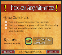
We also used the coins as quest rewards! We had five different quest cards, one of which each guest received on coming in to the reception area after dinner. Each card had three objectives on it, after which the guests were encouraged to take a chocolate coin, and pick up another card if they wanted. The objectives were a variety of silly things designed to get guests chatting and moving around the reception space.


The First Dance

We decided to have our first dance on DDR dance pads. The pads themselves were a wedding gift from my mother. Roy choreographed our dance using Stepmania and DDReam Studio, to the same song I used to propose to him - Home, by Edward Sharpe and the Magnetic Zeroes.


The Entertainment

After the first dance, we opened the floor to some more "normal" dancing - but not for long! We later brought back out the dance pads so everyone could give it a try. We also had Rockband later in the night. Finally, upstairs in the balcony area we had an array of board games for people to play if they weren't interested in dancing. This turned out to be a huge hit, and we were really happy - we weren't sure if they would get played at all!


The Guest Book

At first we had more geeky themes planned for our guest book, but in the end we decided to leave it more open to our guests. We got a polaroid camera and a load of goofy props - some game themed, some just silly - and a blank guest book and invited people to snap a photo of themselves with the props, paste it into the guest book, and add a note. Again we were very pleasantly surprised by how much fun people had with the props - they were running around all over the venue with them!

It was an amazing night, and all our nerdy additions were much more successful than we could have hoped. Hopefully this post helps give ideas to other brides or grooms to be! Feel free to ask in the comments if you need more information about how things were made or done.

Friday, January 13, 2017

On Wearing Many Hats

In indie development, you hear that phase often - "wearing many hats". We use it to mean we have to do a lot of different jobs as indie developers. What we don't say, what I never realised until this week, is that it can mean we do many jobs - and that we don't like some of them. And dare I say, we might not be good at some of them.

Even Business Cat doesn't like business...

I am not a business person. I took some classes in uni, entrepreneurship and business law, and that was enough to tell me it wasn't my thing. But the thing about indie development is that you don't get to pick and choose what jobs you do. You have to do it all. Yes, Bounder Games is a three person team, but none of us have business experience. So when it came time to set up officially as a company, we all had to get our hands dirty and wade the muck of business terminology to figure out what we need to do.

The last week, for me, has been nerve-wracking, anxiety-filled, and depressing. I have never felt quite so out of my depth. Many times I have said to myself, "I have no idea what I am doing - why did I quit my cushy programming job and do this to myself? Everyone will think I am a fool!"

Sometimes ALL of the hats are ugly.

But that's the thing about wearing many hats - some of these hats weren't made with you in mind. They'll be too small, or too big, or itchy, or just ugly. They won't be YOU. As indie devs, we have to acknowledge that we won't be perfect at all the different roles we take on. We have to do our best and get through it anyway. For someone like me, a perfectionist who doesn't like people to see my work if I consider it sub-par, this is really really really hard. I don't want to reveal my weaknesses. How can I show something I know to be less than impressive? Then I will appear less than impressive!

The reality is that, if we don't push through and deal with these things that don't fit quite right - if we don't wear the hats, proudly, and do our earnest best with them, and ask for help if we need it - we fail. We fail ourselves and, if we are in a team, we fail our team. Doing nothing is the failure - not doing badly. Doing badly is a lesson. Doing nothing is giving up. It's an old adage, and it's trite and simplified but it's still true: "You miss 100% of the shots you don't take".

So here's to wearing ugly, ill-fitting hats, and the hope that we can spend most of the time wearing hats we like!

Saturday, February 13, 2016

Armoured Engines Dev Blog - Level System


We've been working on the level system for Armoured Engines. I wanted to create something completely data driven, so that the designers could easily tweak the levels without having to touch Unity scenes, let alone code. This makes sense for Armoured Engines because we don't have a static level with enemies placed that you travel around - instead, our levels are more like a theatre stage where things enter and exit.

I chose to base my implementation of the level system on the stage metaphor - everything that comes into the scene (images, enemies, audio, cutscenes, etc) is an actor.  Each actor is brought onto the stage via a cue. So the actual level file is simply made up of a JSON list of cues, which have metadata attached to them that their cue type can interpret. This includes things like position, speed, audio settings, enemy specific settings, and more. Each cue has an enter time, and some also have an exit time, while others only play once, or loop indefinitely.

Here's an example of some of the cues for the Crystalwhim Caverns, one of the levels shown in our trailer:
"cues" :
[
{
"type" : "GRAPHIC",
 "resourceName" : "ZN-WhiteSands/LV-CrystalwhimCaverns/CrystalwhimCaverns-Rails",
 "startTime" : 0,
 "position" : -5,
 "speed" : 8,
 "layer" : "Train",
 "order" : -10,
 "tile" : true,
 "loop" : true,
 "prewarm" : true,
 "scale" : 0.5,
 "spacing" : -0.7
},
 {
"type" : "GRAPHIC",
 "resourceName" : "ZN-WhiteSands/LV-CrystalwhimCaverns/CrystalwhimCaverns-Rockline2",
 "startTime" : 0,
 "position" : -3,
 "speed" : 1.0,
 "layer" : "Background",
 "order" : -8,
 "spacing" : -2,
 "tile" : true,
 "loop" : true,
 "prewarm" : true,
 "tint" : [150,150,150]
},
 {
"type" : "GRAPHIC",
 "resourceName" : "ZN-WhiteSands/LV-CrystalwhimCaverns/CrystalwhimCaverns-Rockline1",
 "startTime" : 0,
 "position" : -3.5,
 "speed" : 1.25,
 "layer" : "Background",
 "order" : -6,
 "spacing" : -1,
 "tile" : true,
 "loop" : true,
 "prewarm" : true,
 "tint" : [150,150,150]
},
 {
"type" : "GRAPHIC",
 "resourceName" : "ZN-WhiteSands/LV-CrystalwhimCaverns/CrystalwhimCaverns-Rockline2",
 "startTime" : 0,
 "position" : -4,
 "speed" : 1.5,
 "layer" : "Background",
 "order" : -4,
 "spacing" : -1,
 "tile" : true,
 "loop" : true,
 "prewarm" : true
},
 {
"type" : "GRAPHIC",
 "resourceName" : "ZN-WhiteSands/LV-CrystalwhimCaverns/CrystalwhimCaverns-Rockline1",
 "startTime" : 0,
 "position" : -4.5,
 "speed" : 1.75,
 "layer" : "Background",
 "order" : -2,
 "spacing" : -1,
 "tile" : true,
 "loop" : true,
 "prewarm" : true
}
]

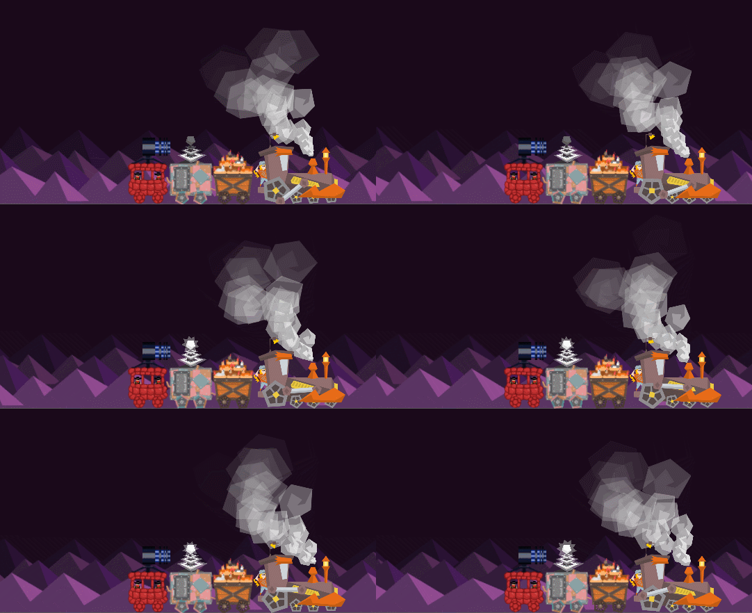
The above example produces the stalagmites lining the bottom of the level, as well as the rails the train runs on. It produces the following in game:

LevelSystemExample

We can bring in some enemies by using some more cues:
 {
"type" : "ENEMY",
 "resourceName" : "EN-IceBat",
 "startTime" : 1,
 "position" : [-7,2.5],
 "heat" : [5, 10]
 },
 {
"type" : "ENEMY",
 "resourceName" : "EN-IceBat",
 "startTime" : 2,
 "position" : [-7,2.5],
 "heat" : [5, 10]
 },
 {
"type" : "ENEMY",
 "resourceName" : "EN-IceBat",
 "startTime" : 3,
 "position" : [-7,2.5],
 "heat" : [5, 10]
 },
 {
"type" : "ENEMY",
 "resourceName" : "EN-CrystalRock",
 "startTime" : 4,
 "position" : [-7,2.5],
 "heat" : [5, 10]
 }

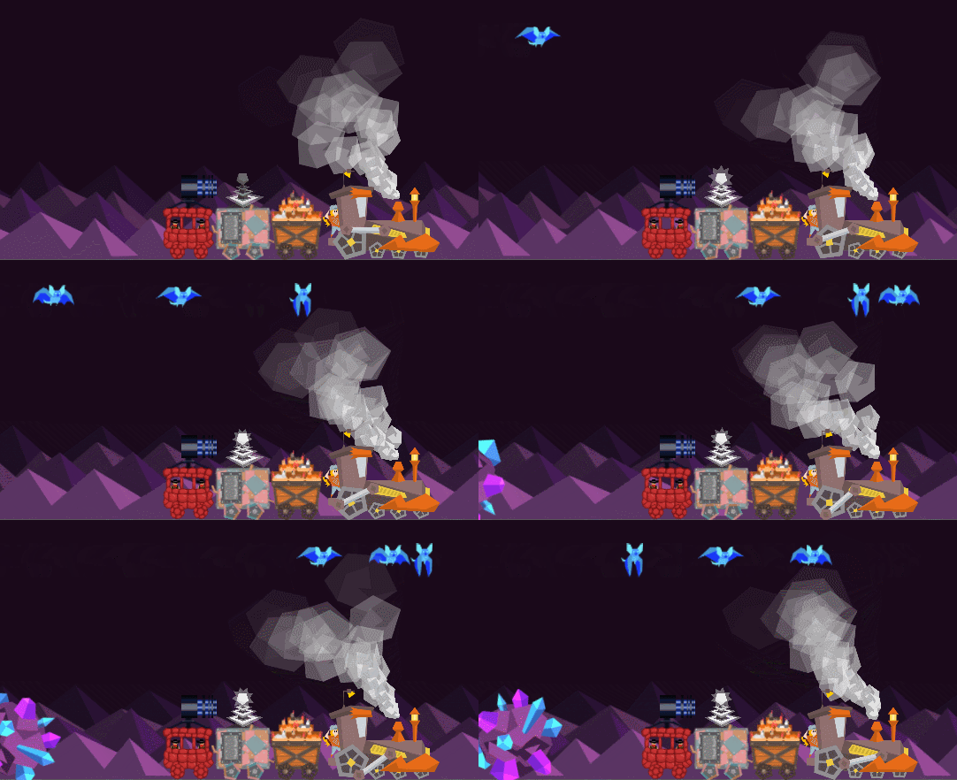
The enemies will come on screen based on their cue entry times:

LevelSystemExample2

This should allow us to easily create hand crafted levels and fine-tune enemy entrances and exits. It will also allow us to add many fun and quirky custom background events and animations, since in the code they are all handled the same way. A lot of the appeal of Armoured Engines comes from it's quirky and colourful presentation, so these touches are really important to achieving the game feel we are going for.

Saturday, November 21, 2015

Armoured Engines Dev Blog - Loading Screen

This post first appeared on the Bounder Games development blog at boundergames.com.

I recently had a fellow indie dev on Twitter asking how we made the Armoured Engines loading screen, so I wanted to share the process with all of you! This process can be used to make an animated loading screen using Unity 5.


The SceneManager


First of all, I have a group of "manager" game objects which all have the DontDestroyOnLoad() function called, so these objects persist throughout the game. One of these is the SceneManager, a singleton object that can be easily accessed from any script in the project. It does a few different things such as abstracting level, town, and map loading - but most importantly, it handles the scene transition.

Here is the function where all the magic happens:

public IEnumerator LoadScene(string sceneName, string music)
{
// Fade to black
yield return StartCoroutine(m_blackness.FadeInAsync());

// Load loading screen
yield return Application.LoadLevelAsync("LoadingScreen");

// !!! unload old screen (automatic)

// Fade to loading screen
yield return StartCoroutine(m_blackness.FadeOutAsync());

float endTime = Time.time + m_minDuration;

// Load level async
yield return Application.LoadLevelAdditiveAsync(sceneName);

if (Time.time < endTime)
yield return new WaitForSeconds(endTime - Time.time);

// Load appropriate zone's music based on zone data
MusicManager.PlayMusic(music);

// Fade to black
yield return StartCoroutine(m_blackness.FadeInAsync());

// !!! unload loading screen
LoadingSceneManager.UnloadLoadingScene();

// Fade to new screen
yield return StartCoroutine(m_blackness.FadeOutAsync());
}

As you can see, this function is a coroutine. I won't be going into the details of coroutines but they are basically awesome so I definitely suggest reading up on them. Without a coroutine this function would have to be handled using Update() and would be much more complicated!

Load the Loading Screen


We don't just want the loading screen to appear abruptly over our current screen - in game dev, you very seldom want anything to just appear. Instead, we will fade to black (since for our scene the loading screen is black), then load the loading screen, then fade the black away.

To do this we use three asynchronous methods. First we use a simple coroutine I wrote which is attached to a simple black sprite covering the scene: FadeInAsync(). This simple change the sprite's alpha from 0 to 1.0 over a set number of seconds.

// Fade to black
yield return StartCoroutine(m_blackness.FadeInAsync());

Once that coroutine returns, the screen is black and ready for our loading screen to be loaded. Here I use Application.LoadLevelAsync(), a built in Unity function. This unloads our current scene (aside from things marked DontDestroyOnLoad() such as our SceneManager and its black sprite) and loads our new scene.


// Load loading screen
yield return Application.LoadLevelAsync("LoadingScreen");

// !!! unload old screen (automatic)

Once LoadLevelAsync() returns, it's time to fade out our black using FadeOutAsync(), the reverse of our previous FadeInAsync().


// Fade to loading screen
yield return StartCoroutine(m_blackness.FadeOutAsync());


Loading the New Scene


Loading the next scene is a bit more complicated. I use Application.LoadLevelAdditiveAsync() to load in our new scene. This loads the new scene but does not destroy anything in our loading scene. This means that is going to have to happen manually! Don't forget this or you will end up with both your new scene and the loading scene active when the process is done.

float endTime = Time.time + m_minDuration;

// Load level async
yield return Application.LoadLevelAdditiveAsync(sceneName);

Another thing to note is that you will need to make sure your loading scene is on a higher layer than everything else in your new scene, or the new scene has any renderers turned off when loaded. Otherwise the new scene elements will draw on top of your loading scene.

Similarly, make sure any logic in your new scene is paused until your loading scene is completely gone - otherwise your character may die before the scene is loaded!

At this point, we chose to set a minimum amount of time for the loading scene to run, in order for it not to look jerky for very short load times. To do this, we simply wait for the remaining seconds that have not yet elapsed. This is completely optional, but if you use it make sure this time is quite short.

if (Time.time < endTime)
yield return new WaitForSeconds(endTime - Time.time);

This is also the time at which we chose to start our next scene's music, but that may be different for your project. We have a music manager which handles fading out old music and in new music using the PlayMusic() function.

// Load appropriate zone's music based on zone data
MusicManager.PlayMusic(music);


Unload the Loading Screen


Once the new scene is loaded in the background, it is time to get rid of our loading screen. Again, we don't want it to just instantly disappear, We face back in the black background first, again using FadeInAsync().


// Fade to black
yield return StartCoroutine(m_blackness.FadeInAsync());

Once the black background is faded in, we can get rid of the loading screen. However, there is no built in method to do this since the loading screen and new scene are now merged into the active scene. To get rid of the loading screen, we've created a separate singleton that lives on the root object of the loading screen called LoadingSceneManager. This singleton's sole responsibility is deleting it's object, though in the future we may add more functionality such as a loading bar or percentage display. For now we call a simple function UnloadLoadingScene() which simply destroys the loading scene's root object.

// !!! unload loading screen
LoadingSceneManager.UnloadLoadingScene();

At this point, if you have turned off drawing for your new scene, you should turn it back on before fading the black screen cover away.

With the loading screen destroyed we are free to fade away the black using FadeOutAsync(). At this point you may want to signal to your in game scene that the new level is ready to start, so game logic can be turned back on.

// Fade to new screen
yield return StartCoroutine(m_blackness.FadeOutAsync());


Potential Issues


When implementing this, we had several issues. First, the cameras in our title screen and in game level had different orthographic sizes, so when the new scene finished loading, the scene appeared to jump to a new size. For us this was simple as we hadn't actually intended for the cameras to be different sizes, so we simply fixed that error and things were fine, but if you do intend to have different sizes you should make sure you load your new camera during one of the black sections rather than during the loading screen itself.

We also had a problem with our UI from our new scene showing on top of our loading screen and black backgrounds. This is because our UI was set to use screen space overlay and could not have a rendering layer set. We solved this by tying the UI in each scene to it's camera, and settings a render layer below that of the loading screen. This may not work for everyone, so if you need your UI in screen space overlay you can may your black screen cover a UI object rather than a sprite and make sure it draws on top of your UI. You will also need to turn off the drawing of your UI until the black screen cover has faded in.

Hopefully this will help someone else make an animated loading screen! Feel free to ask any questions in the comments or contact me on Twitter @Jiyambi!